This package works along with RTE’s adequacy software ANTARES : https://antares-simulator.org/
antaresViz is a package which proposes relevant graphs
and maps to vizualize the results of an ANTARES study, with numerous
settings and possible customizations.
Where everything starts
The data from an ANTARES study can be imported and easily manipulated using the antaresRead package.
The examples presented below have been build on a fictionnal study whose output have been loaded with antaresRead. They contains different types of elements :
- outputs with an annual and an hourly time step,
- synthetic outputs (averaged on several Monte-Carlo years) and detailled outputs (given year by year),
- outputs for areas, links, clusters and districts.
load("data_for_antaresViz_vignette_extralight.Rdata")The aim of this vignette is to give a quick overview of the possibilities offered by the package antaresViz. The data with which the following graphs have been plotted are fictionnal.
The simple power of the plot function
The plot() function, used with an antaresDataList object
(i.e. an object returned by the antaresRead::readAntares()
function) offers different possible vizualisations.
Moreover, this function is really easy to use. It opens a shiny interface which let the user decide :
- Which type of element he wants to study : areas, links or disctricts.
- Which variable he wants to analyze.
- With which type of graph : barplot, time series, probability density function, heatmap, etc.
- For which area(s), link(s), or district(s).
- And during which time period.
plot(data_hourly_synthesis)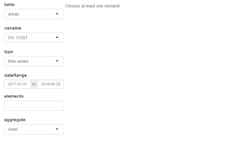
Note that all the interface manipulation can also be set directly in
the arguments of the plot function. Some examples of the
multiple graphs that can be returned by this function are given
below.
Heatmap of the congestion probability of one interconnection
plot(
  data_hourly_synthesis_1year,
  table = "links",
  variable = "CONG. PROB +",
  type = "heatmap",
  elements = "25_c - 26_d",
  interactive = FALSE,
  width = "100%",
  height = 400,
  main = "Congestion probability"
)
Note that the plot() function also contains a
compare argument which allows comparisons between :
- different variables
- different areas/links/district
- different studies
When the production meets the demand
The prodStack function builds a graph which contains the
time series of demand in one area (or the sum of the demand of a set of
areas) along with the generation of this area (or set of areas), divided
between the different fuel types (e.g. nuclear, gas, wind, etc).
prodStack(data_hourly_synthesis)Once again, this function is easy to use and opens a shiny interface which let the user manipulate the selected areas and time range. Some settings can also be passed to the function through its (optionnal) arguments.
prodStack(
  data_hourly_synthesis,
  stack = "eco2mix",
  areas = "37_h",
  dateRange = c("2018-01-08", "2018-01-21"),
  main = "Production stack",
  unit = "GWh",
  interactive = FALSE,
  width = "100%",
  height = 500
)
The graphical template used by default is the one of the RTE’s application eco2mix
This template can though be redefined completely by the user with the
function setProdStackAlias().
The exchangesStack() function proposes similar graphs
with a superposition of all the imports and exports of an area.
exchangesStack(
  data_hourly_synthesis,
  area = "37_h",
  dateRange = c("2018-01-08", "2018-01-21"),
  main = "Import/Export of area 37_h",
  unit = "GWh",
  interactive = FALSE,
  width = "100%",
  height = 500
)
Everything looks better on a map
Last but not least, antaresViz proposes several function
to vizualise the results of a study on a map.
To do so, the first function to use is mapLayout(). This
function launches an interactive application that let the user place
areas of the ANTARES study on a map.
antares_layout <- antaresRead::readLayout(opts = antaresRead::setSimulationPath(study_path))
map_layout <- mapLayout(layout = antares_layout)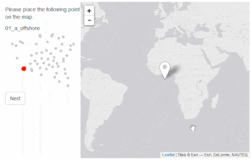
(Once again : the study presented here is fictionnal !)
The function plotMap() then generates an interactive map
that let the user visually explore the results of an Antares simulation.
By default the function starts a Shiny gadget that let the user choose
:
- Which variable to represent
- With which type of vizualisation
- areas : color, size, popup, label
- links : color, width of the link, popup
- For which time step or date range
plotMap(data_hourly_synthesis, map_layout)Some examples of results returned by the plotMap()
function are depicted below.
C02 emissions
This first map depicts the annual CO2 emissions of all the areas of the ANTARES study.
plotMap(
  data_annual_filtered, map_layout,
  showLabels = TRUE,
  sizeAreaVar = "CO2 EMIS.",
  interactive = FALSE,
  labelAreaVar = "CO2 EMIS.",
  colAreaVar = "CO2 EMIS.",
  type = "avg",
  options = plotMapOptions(
    areaDefaultSize = 30,
    labelMaxSize = 8,
    labelMinSize = 14,
    areaColorScaleOpts = colorScaleOptions(
      zeroCol = "white",
      posCol = "red2"
    )
  ),
  width = "100%",
  height = 600
)
Average balance and flows in the system
This map illustrates the annual balance (MWh exported if positive - or imported if negative - during an hour) of each area and the annual flows of each link.
plotMap(
  data_annual_synthesis,
  map_layout,
  showLabels = TRUE,
  colAreaVar = "BALANCE",
  interactive = FALSE,
  labelAreaVar = "BALANCE",
  sizeLinkVar = "FLOW LIN.",
  type = "avg",
  options = plotMapOptions(
    areaDefaultSize = 30,
    labelMaxSize = 10,
    labelMinSize = 8,
    areaColorScaleOpts = colorScaleOptions(
      negCol = "tomato3",
      zeroCol = "white",
      posCol = "blue3"
    )
  ),
  width = "100%",
  height = 600
)
Energy mixes
The proportion of each energy type in the annual production of each area is illustrated on this next map. The actual generated energies (in MWh) can be known by clicking on the pie charts.
data_annual_synthesis$areas <- data_annual_synthesis$areas[, `:=`(
  THERMAL = NUCLEAR + LIGNITE + COAL + GAS + OIL + `MIX. FUEL` + `MISC. DTG`, HYDRO =`H. ROR` + `H. STOR`
)]

plotMap(
  data_annual_synthesis,
  map_layout,
  interactive = FALSE,
  sizeAreaVars = c("HYDRO", "SOLAR", "WIND", "THERMAL"),
  popupAreaVars = c("HYDRO", "SOLAR", "WIND", "THERMAL"),
  areaChartType = "pie", type = "avg",
  options = plotMapOptions(
    areaDefaultSize = 25
  ),
  width = "100%",
  height = 600
)
Let’s get started
The antaresViz package is available on the CRAN and can
be installed with :
install.packages("antaresViz")